
This is a quick sitemap that I drew up to figure out how to organize content within my website, and how to set up internal links.

This is just a typecard that I created using various google fonts. I labeled what each font was to be used for throughout the site.
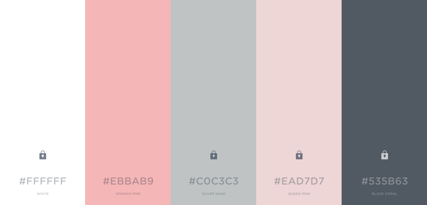
This is a color palette that I put together using Coolors.co. The site is set up such that the user may choose five colors. I didn't end up using all of the colors selected, in my initial site design because I focused most of my time on making sure the site was functional over aesthetically pleasing, so i stuck to a very simple design and color scheme.
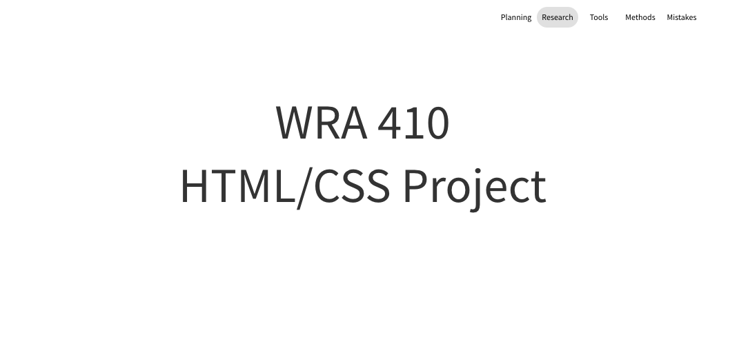
This was the first wireframe that I created. It is just a quick rendering of the landing page for the site. Just briefly describing the purpose of the site, and displaying a navigation bar.
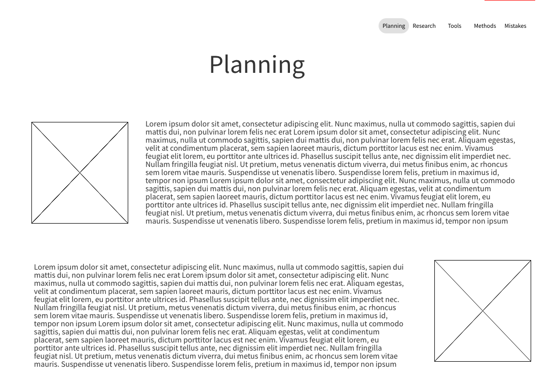
My initial wireframe for the planning page was set up so the body content and images would rotate postions from one row to the next. I started out my building process for this page with images on the left and text on the right using CSS Grid and decided to work on this formatting last because it is purely for aesthetic purposes.
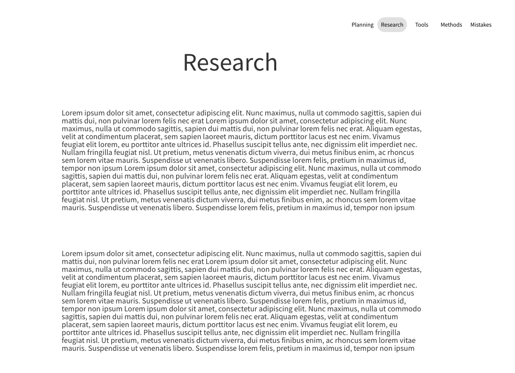
The research wireframe is set up differently than it acutally turned out to look like because I had included links under each paragraph to make it easy to go back and reference my sources, as well as to site them.
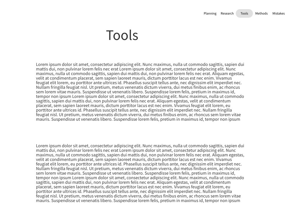
Similar to my research wireframe, I included links in my final tools page to make it easy to go back to each of the resources I used if needed.

My methods wireframe is pretty accurate because this page was just used as a sort of process document. So I posted each step that I took throughout the building process.
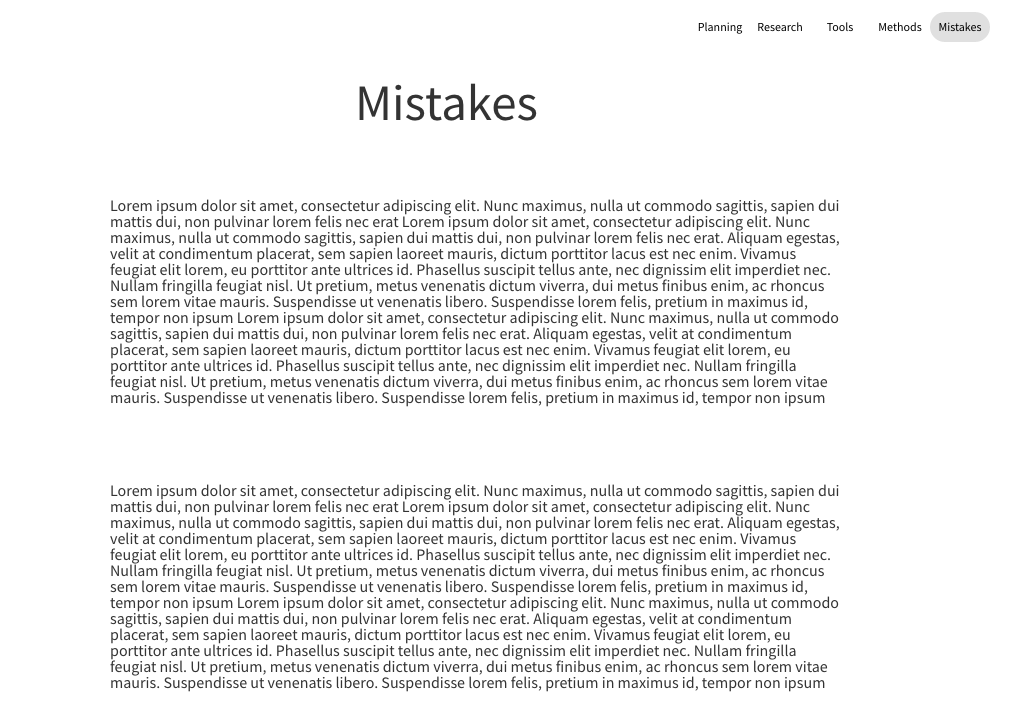
Similarly, my mistakes page was used as a reflection page, so it was designed to be pretty text-heavy.